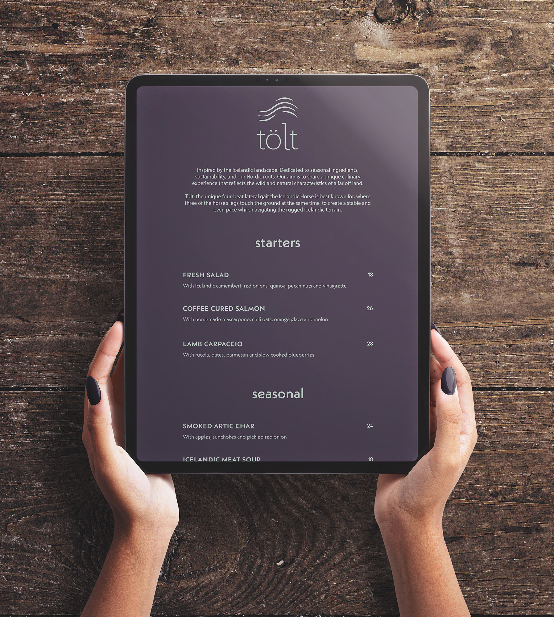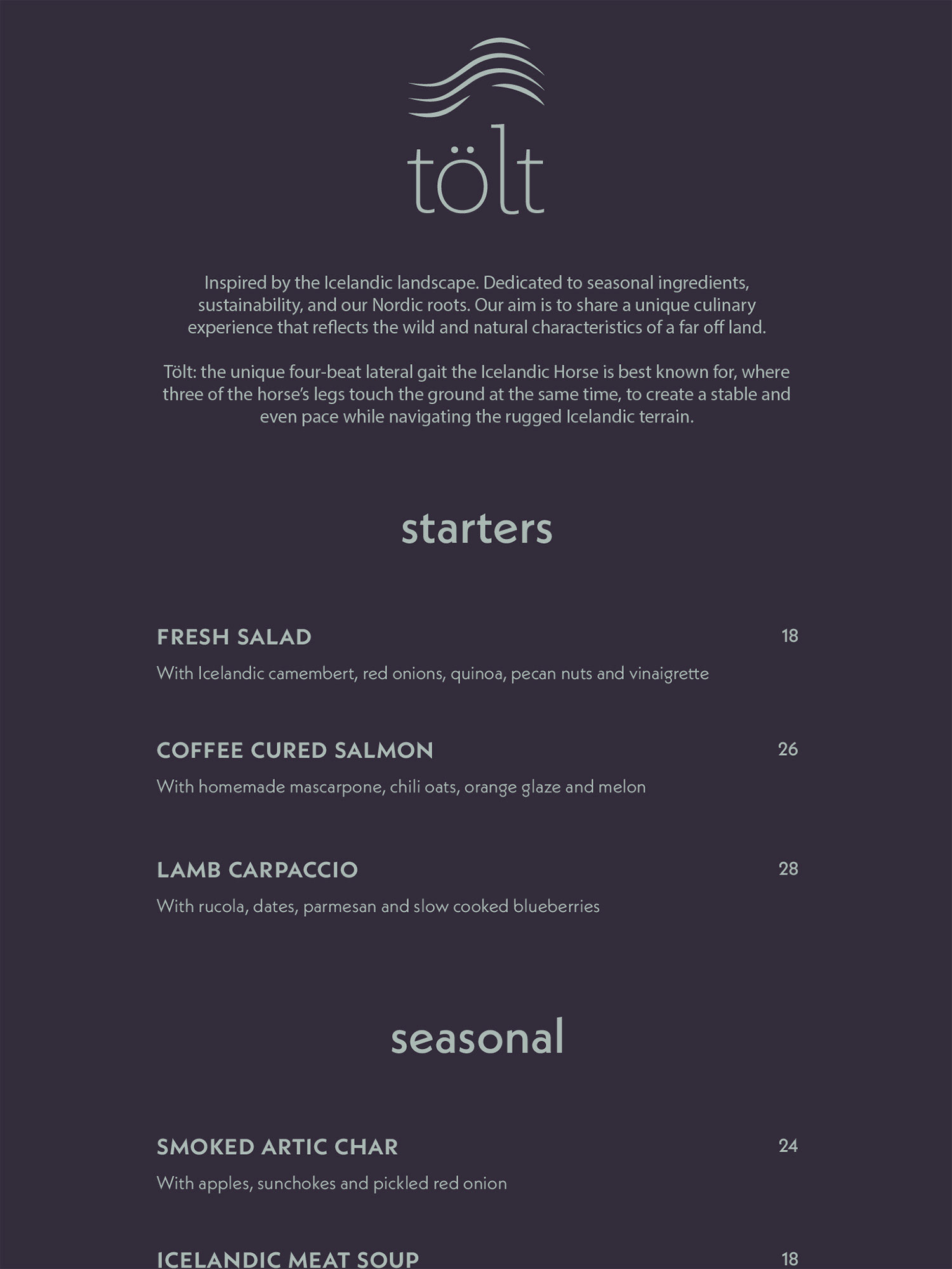

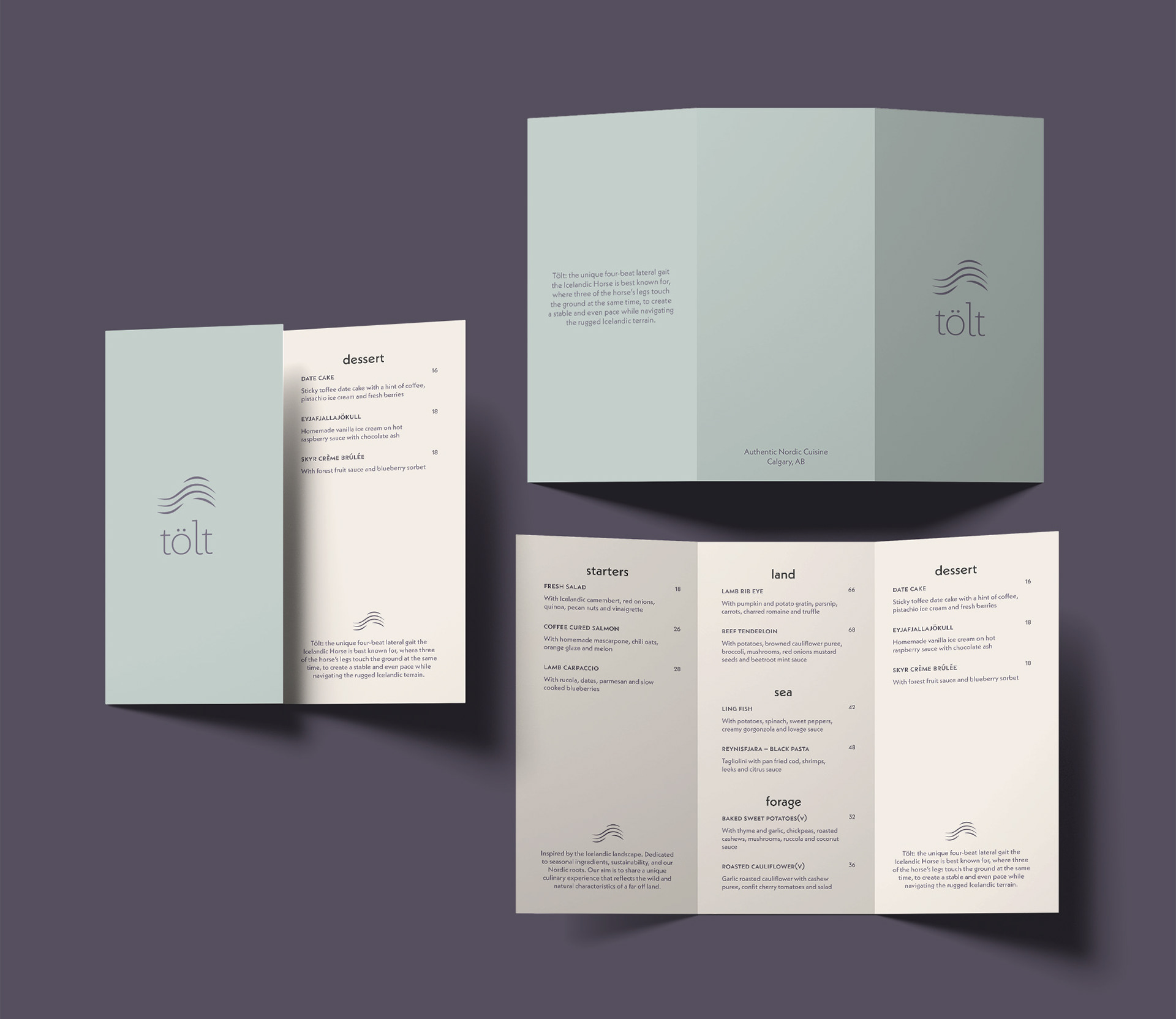
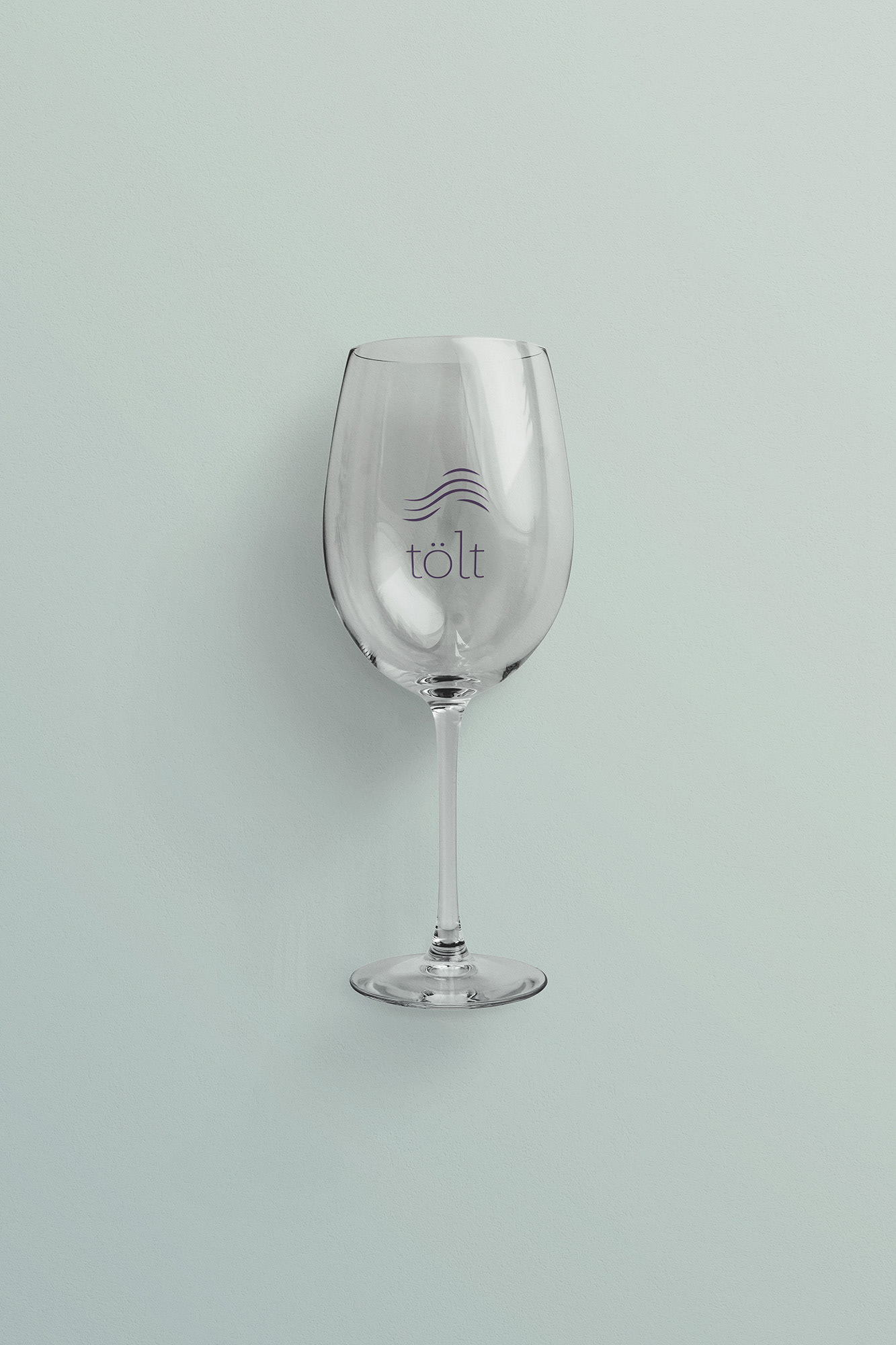
For the rebranding of Tolt, I took a deep-dive into their Icelandic (Nordic) roots. Tolt offers a unique culinary experience that is as wild and natural as the landscape, and my aim was to reflect this in the design of the new logo and menu.
Going for a wild, but luxurious theme, I explored a variety of ideas based around Iceland’s culture. I landed on Tolt, which is a gait that is unique to Icelandic Horses. While Iceland is rugged and wild, the Tolt is a smooth, controlled ride.
Using the inspiration of the Icelandic Horse, Tolt is able to represent the untameable wilderness and balance it with luxury and high-end equestrian. Guests can experience the natural cuisine of Iceland right here in Calgary, and in the comforts of Tolt’s dining space.
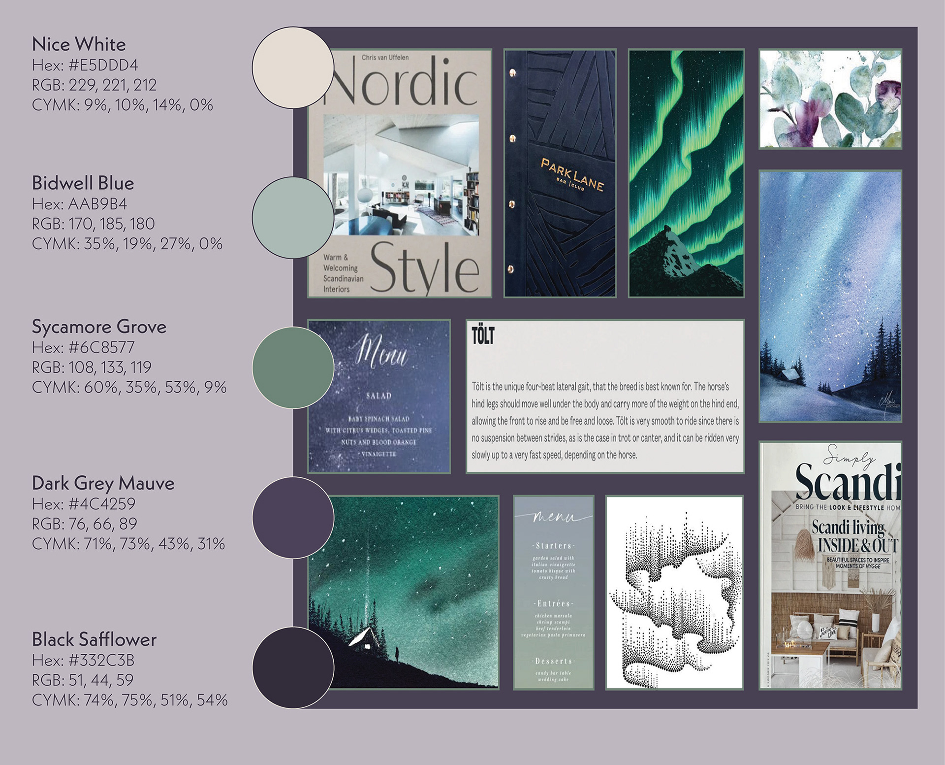
The colour palette was inspired by the Icelandic landscape, pulling purples and greens from the dark northern sky. The rich, luxurious purple is balanced with the batural, earhty greens. The off-white is a very low saturated orange, to balance the cooler hues with warmth.
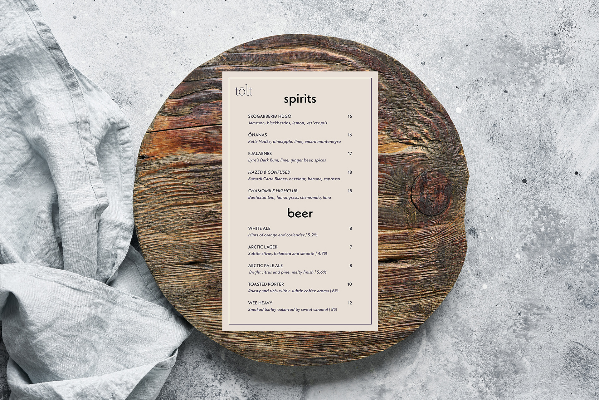
Influenced by Nordic culture, the typefaces used for TÖlt are modern, unique, and minimalist. Jubilat is a slab serif which I used to create the logo. Minor adjustments were made to round out Extra Light font and make it more fluid to match with the movement of the logo. Neue Kabel is a geometric sans-serif with a very Nordic look.
When an Icelandic Horse is performing the TÖlt, it provides a smooth ride in which the weight is on the back two legs and one of the front legs is off the ground. The logo represents the fluidity of the smooth ride and is a subtle nod to the northern lights in Iceland. The shorter lines are representative of the horses mane, back legs, and the one front leg off the ground.
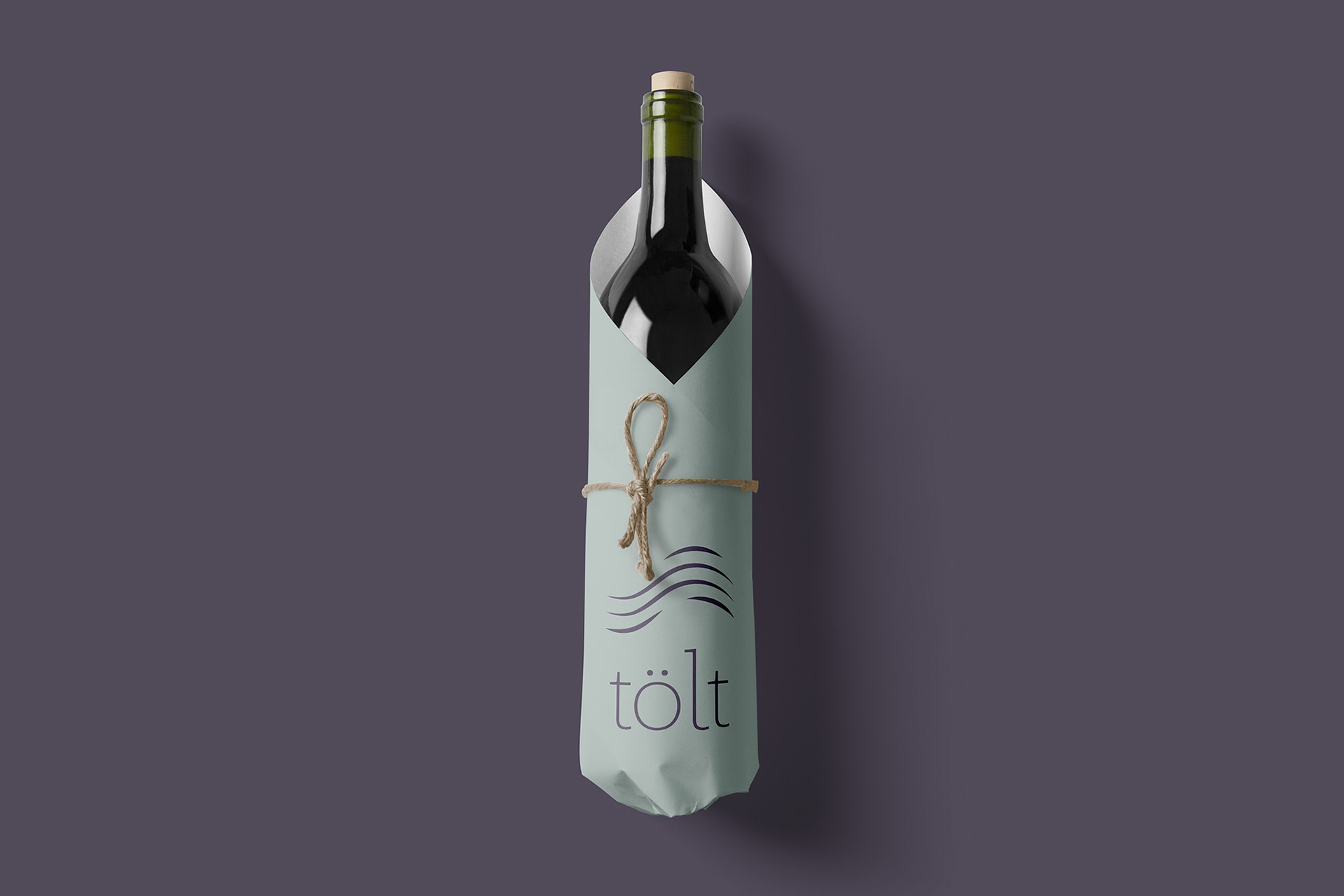
Above: Branding on wine packaging
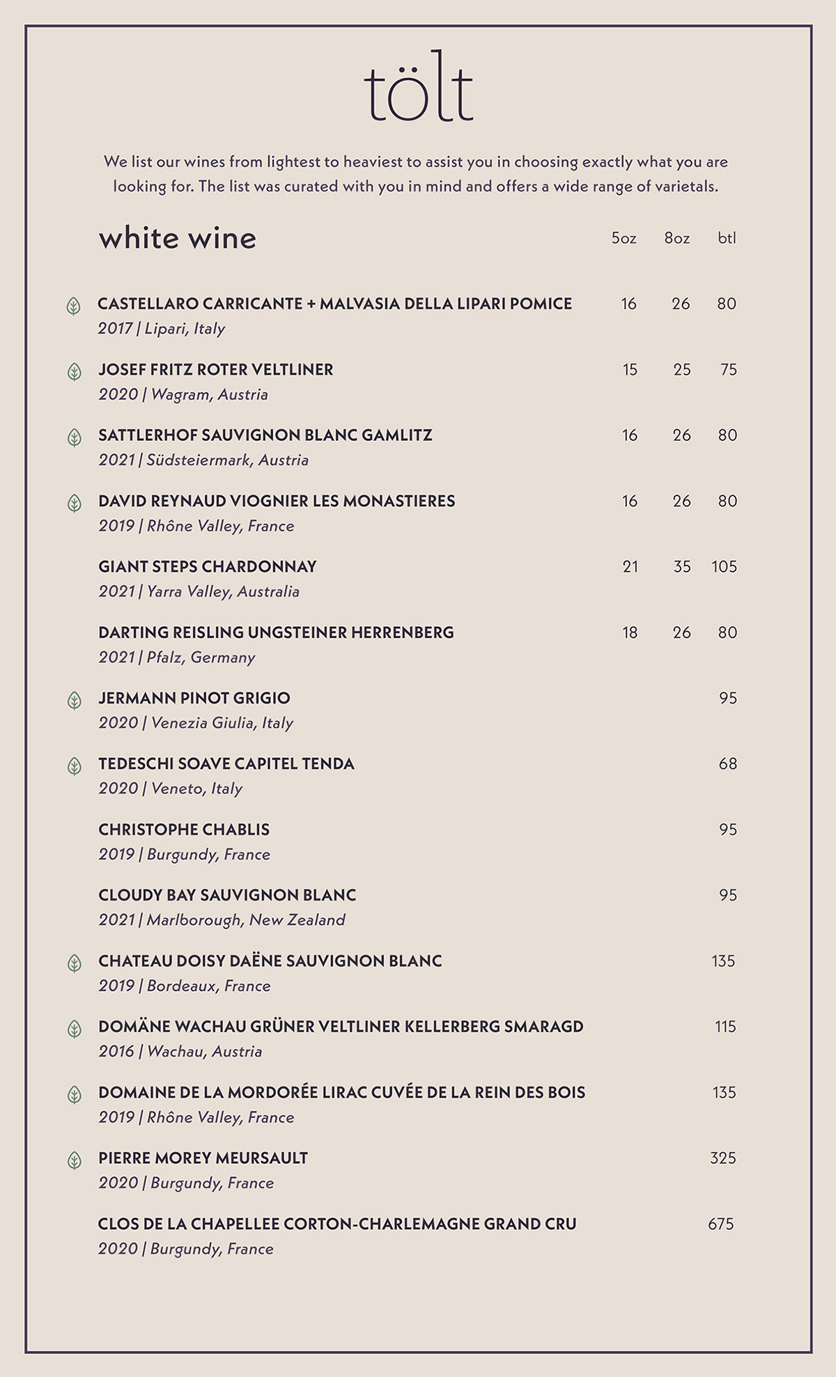
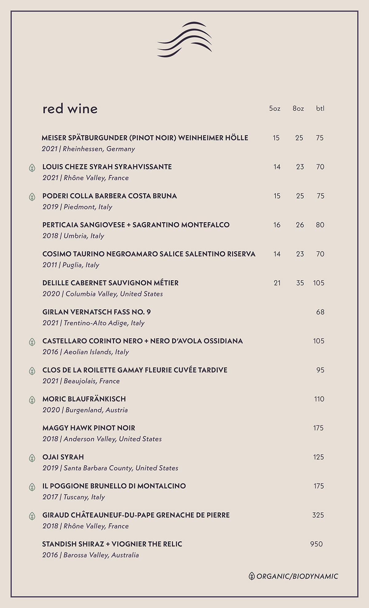
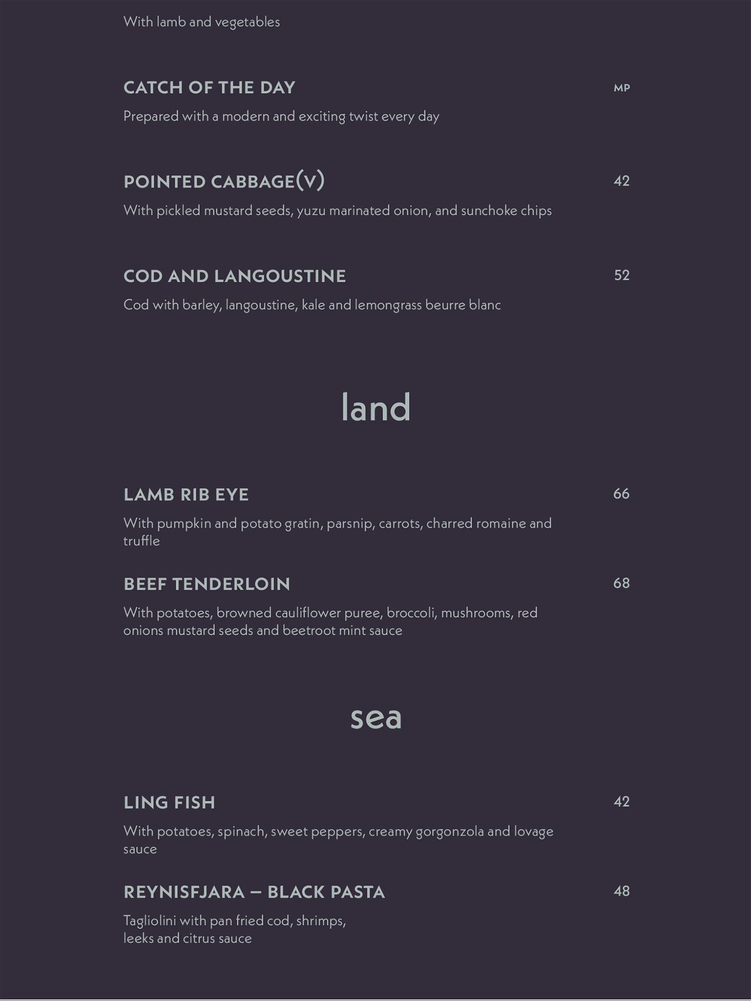
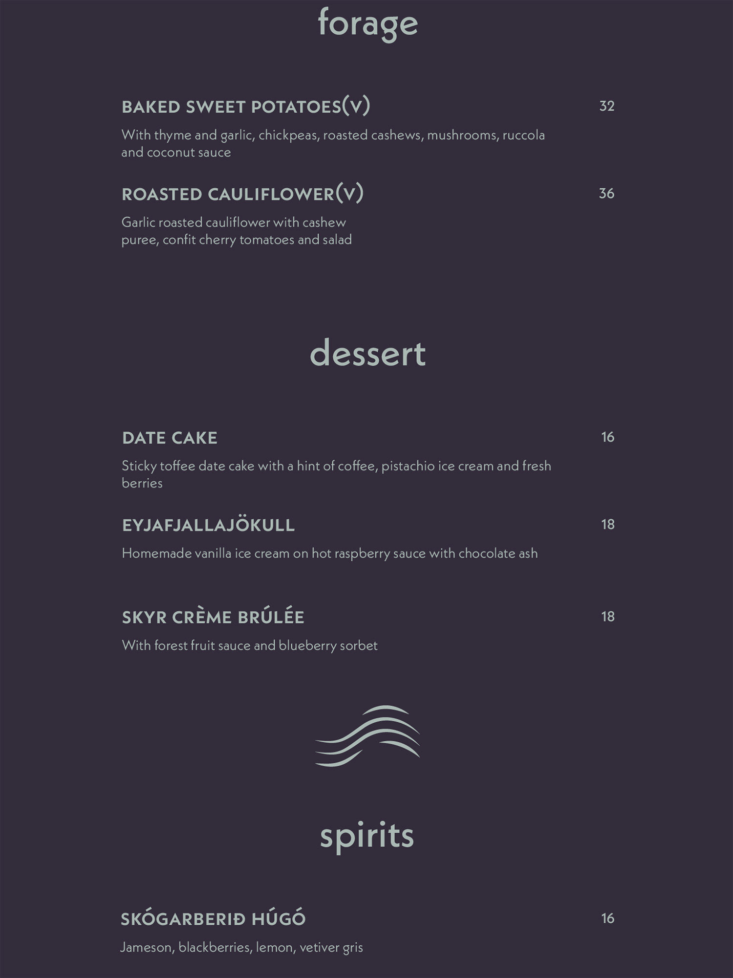
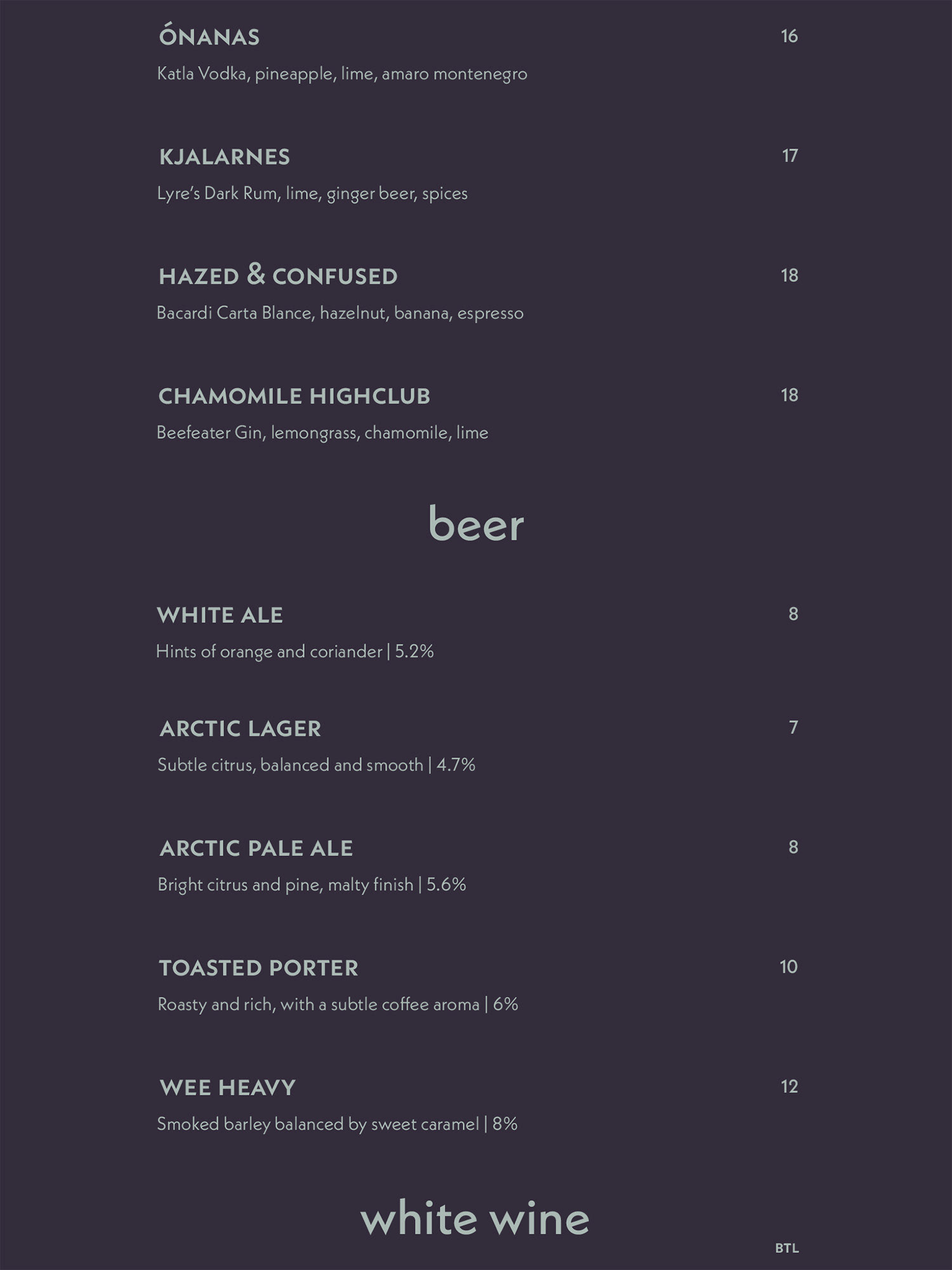
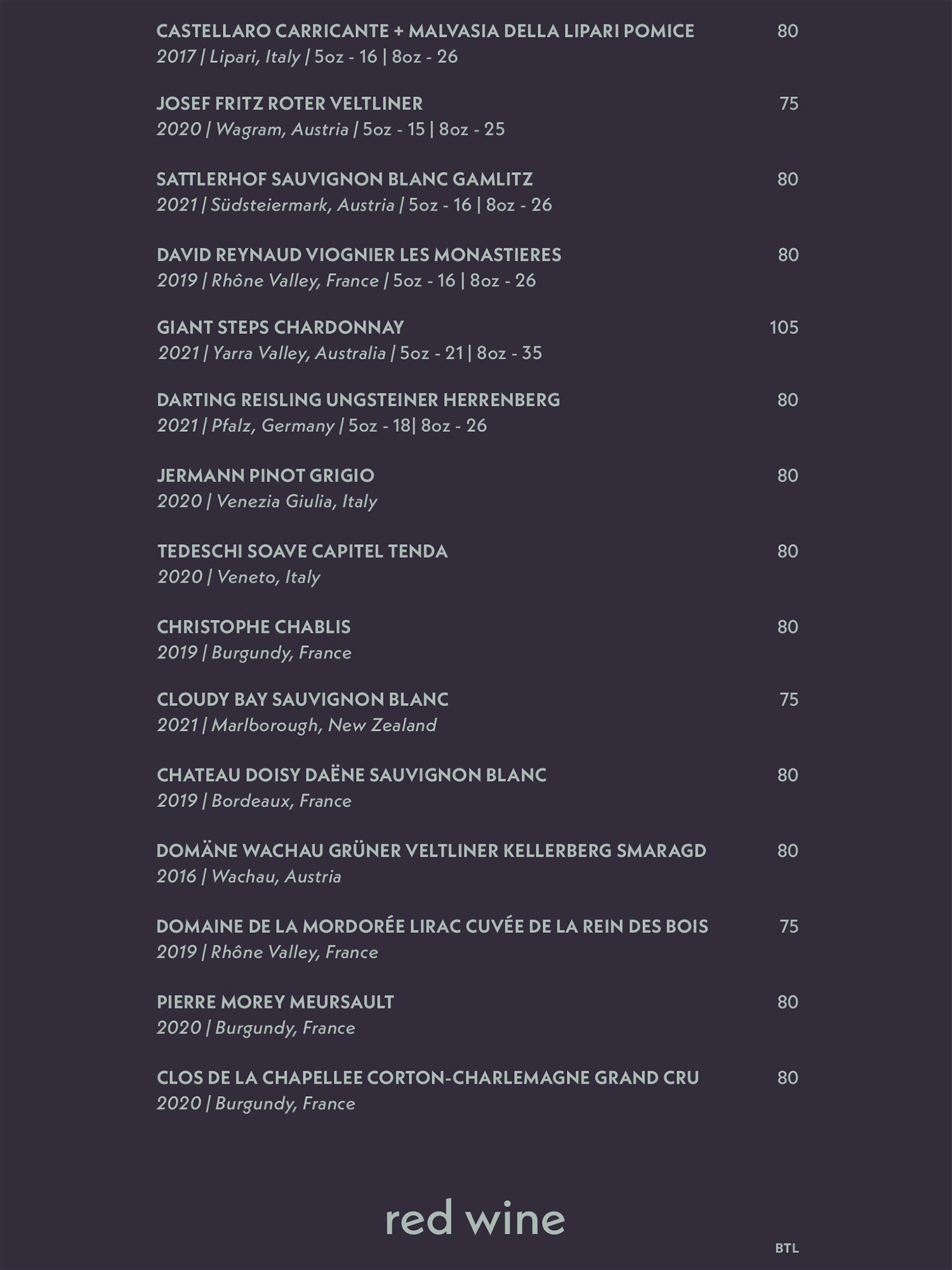
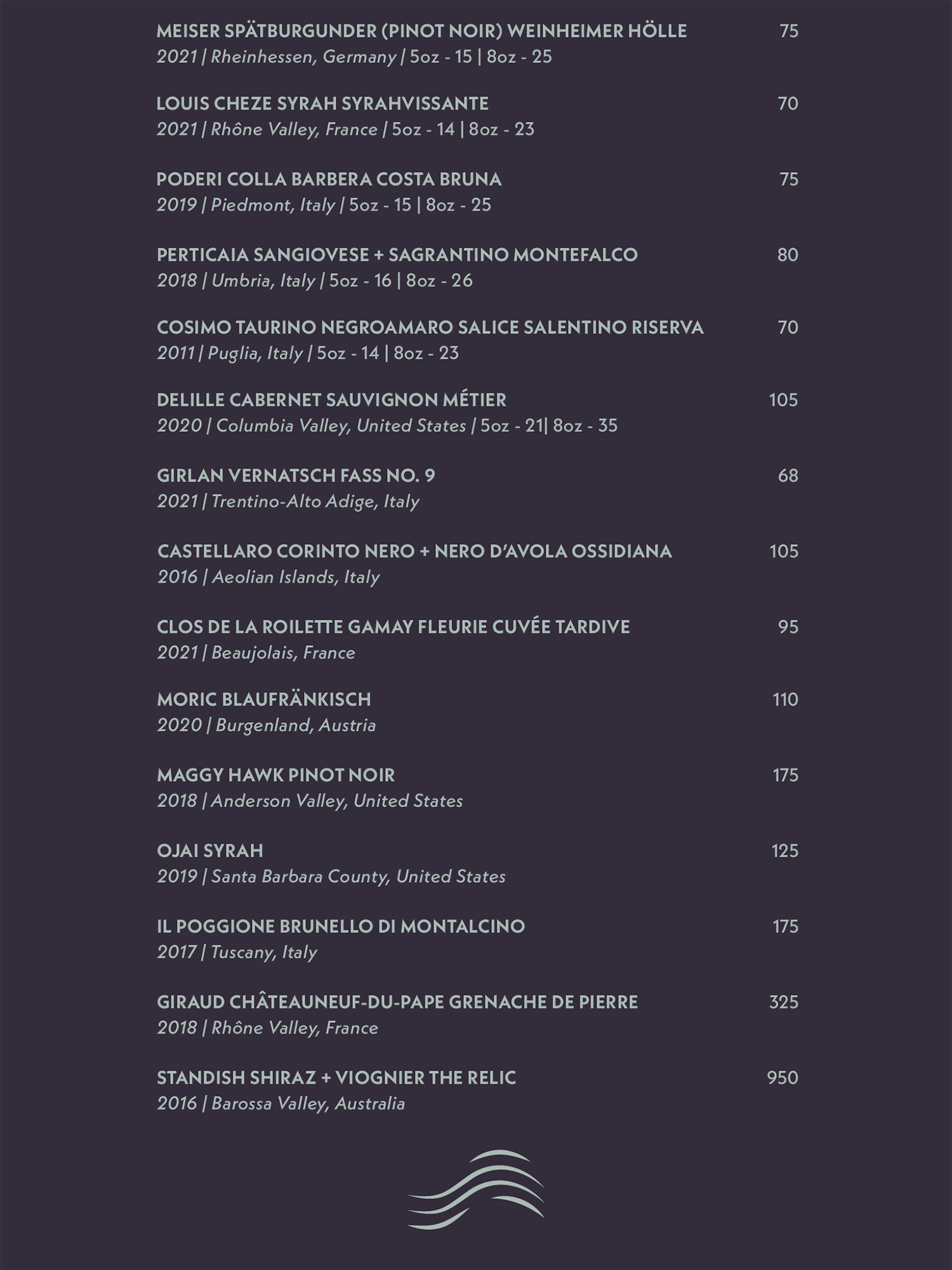
Below: Wine Menu, Front and Back