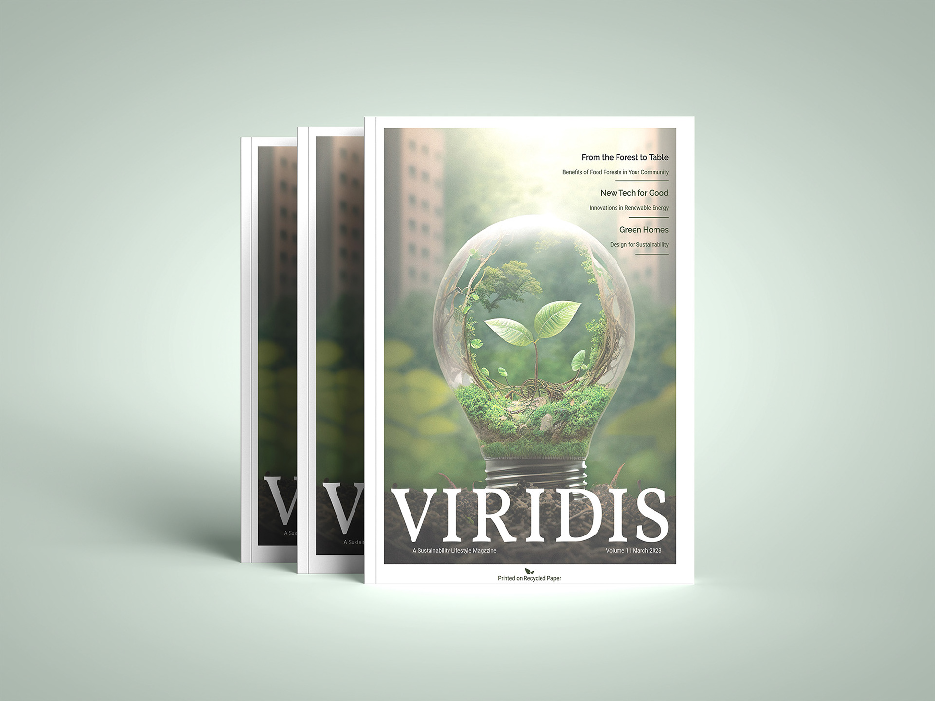
Viridis is a sustainable lifestyle magazine, which focuses on providing it’s readers with valuable insight and numerous ways to begin everyone’s own journey in sustainability. The magazine is modern and approachable.
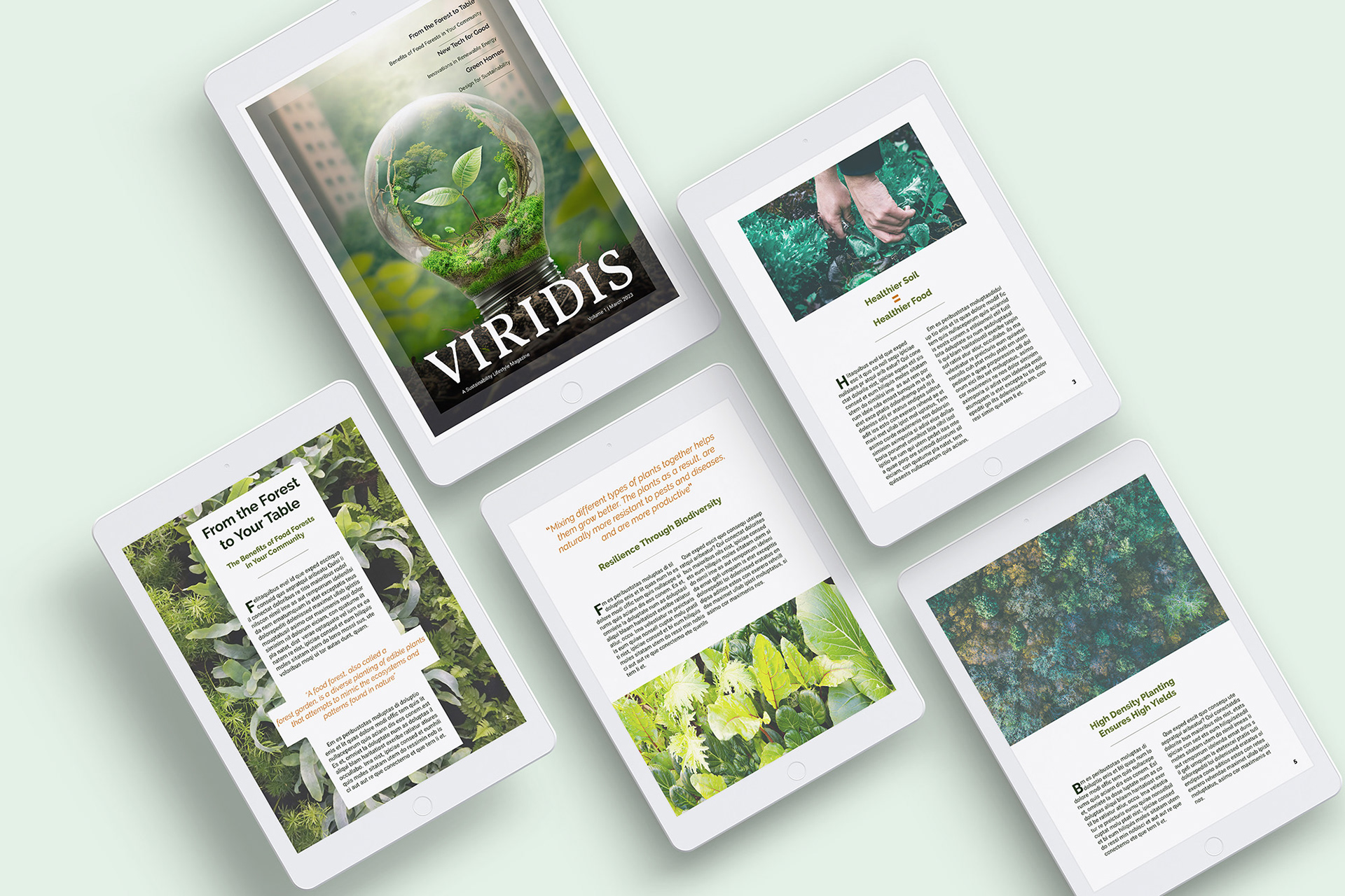
In building this magazine for various delivery, in both print and digital, I’ve selected colour and typography that evoke a modern and simplistic, natural feel. I’ve worked on finding the balance between editorial and easily digestible.
Overall, the design theme for this magazine is simplicity and organic. The colours selected were chosen to reflect the natural environment, as the target audience will be connected to nature and sustainability in some aspect. I wanted the design to cater to a diverse audience and not become unapproachable to those who do not have the same resources. The point of the magazine is to help it’s readers make a better environment for themselves, and the design reflects this in being straightforward and easy to follow.
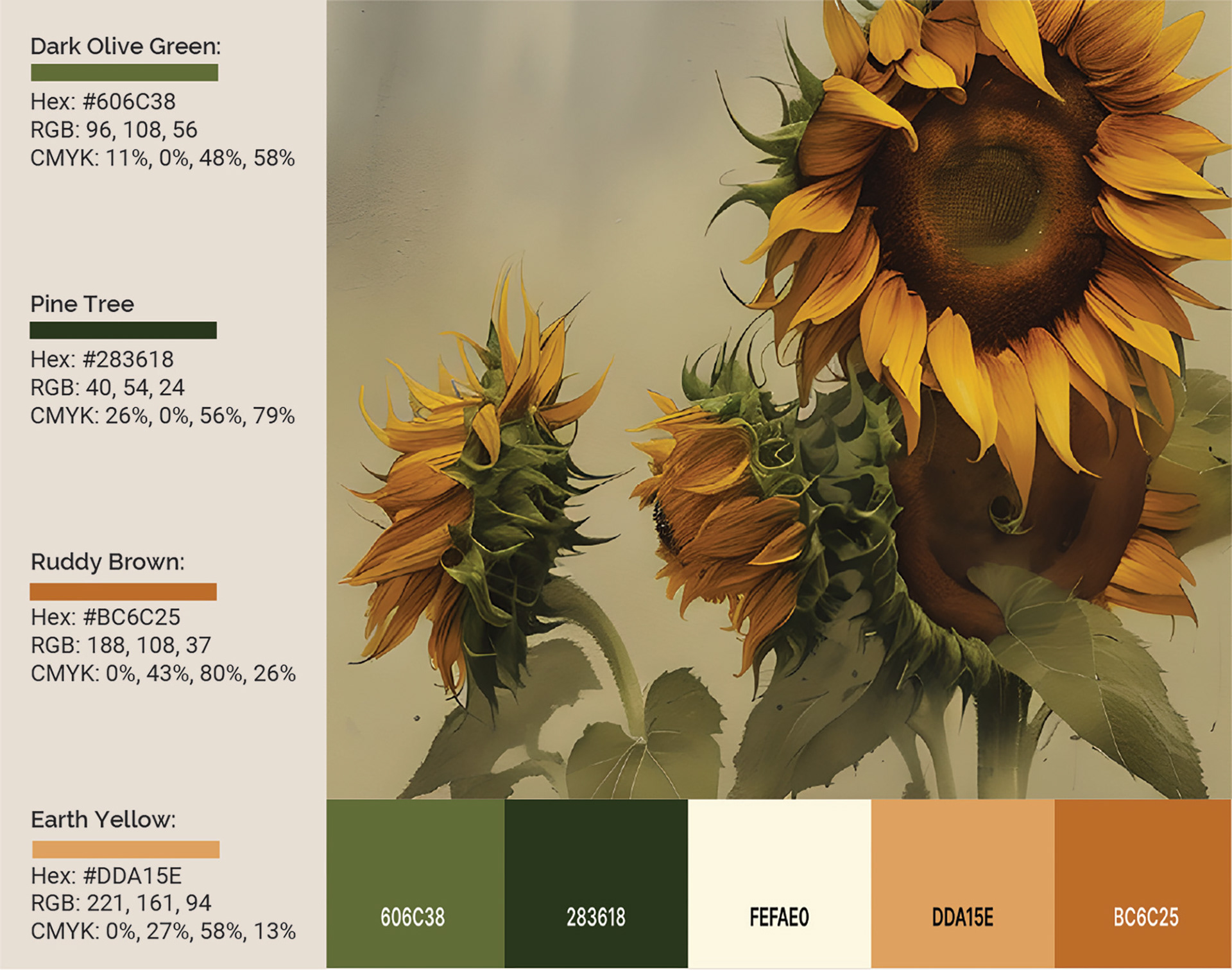
The colours I’ve chosen for Viridis are representative of the earth, while remaining understated and sophisticated for our editorial magazine. Greens reflecting the natural world and all of the plants and trees, providing readers with a sense of calm connection with the environment. Oranges complimenting the green and adding organic warmth to the palette. Representing the earth’s natural browns.
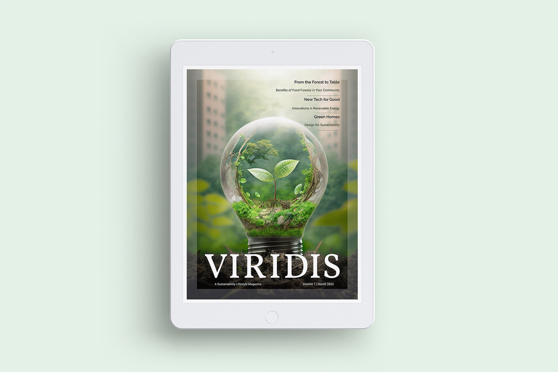
Vollkorn Medium was chosen as the sustainable lifestyle magazine’s title typeface. It’s heavier serifs and weight works well as an eye-catching display face, while still holding legibility against various backgrounds. Vollkorn feels serious while also having a down-to-earth look.
Raleway SemiBold and Bold were used for the headers and sub headers in Viridis. I chose san-serif typefaces for both the headers and body to provide a modern look that caters to all audiences. The w and l gives the typeface a distinctive and memorable look, without being too distracting.
Roboto Regular was used for the body text. Using san-serifs for Viridis helps the legibility as we transition articles from print to digital. This typeface is incredibly legible on smaller scales, which works well for the magazine’s mobile version. Roboto and Raleway are both neo-grotesque typefaces.